Be warned, this may be a lengthy read. The kitchen probably had the most changed about it so lots to detail. And it is also a combination of two rooms: the kitchen & dining room, which is now our breakfast room since our dining table was too large. You can see our new dining room here. But, I think this is my favorite room in the house. It did not start out that way (wait until you see the before photos!) but it feels exactly how I wanted it to feel.
So, an introduction to the space. This is the kitchen when we first began work on the house...and maybe after a little clean up.
Dingy walls, dark (but sturdy) cabinets and that blasted pink tile again. Remember that pink mosaic tile on the bathroom floor? Well, guess what the counter tops were made of? That was one of the first things I knew needed to go. Not only was it not pretty, it was a harbor for bacteria in between the tiles where the grout (which was no longer white in some places) was coming out. And rather than re-grouting the whole thing, it just made more sense to remove it. And that was the pitch I made to the landlord, ha ha.
 |
| I called these the pink tombstones. |
I'm sure you'll notice the pink tile back splash also. While I sold him on the counter top, again like in the bathroom, the tile was in too good of condition to remove, so we had to keep it. But that didn't mean it had to be visible. ;)
Well, here we go. :)
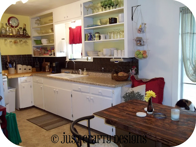
Ok, so dingy walls got a new coat of sunny yellow paint and tile counter tops were removed. We installed a pre-fab laminate counter top for the long section (there will be a quick note about that below) and a custom-made butcher block for the short section. I wanted the cabinets lightened up to help make the kitchen feel larger, so we decided to paint them a simple white. We replaced the hardware with white porcelain knobs. We also decided to do open upper cabinets to make the kitchen feel larger. Plus, I've always wanted open cabinets. :)
Wait, where'd the pink back splash go? O, yeah, it's hidden behind the new awesome back splash you see now! Those are faux tin ceiling tiles that we glued on top of the pink tile. It was so easy to do and looks amazing!
 |
| See my little {Spit*Shined} project in the "after" shot? Isn't it just perfect in here?! |
I had wanted to do a black and yellow kitchen with white cabinets. When we moved, we had no appliances, so we figured on acquiring black ones. But, my dad found the stove for FREE in nearly-new condition, so we couldn't turn it down. The refrigerator was originally beige so we painted it white with appliance paint and now that I have a yellow and white kitchen, with bronze & red accents, I love it. I don't think I would have loved the black and yellow as much. Funny how it worked out. :)
Storage was a bit of an issue in this kitchen, especially going from a larger one in our old house to this much smaller one. What you can't see behind the refrigerator is a tall open shelf that is our pantry. I have plans one day to enclose it, but for now, it serves its purpose.
The wood floors throughout the house actually extended into the kitchen. When we were removing the linoleum and discovered this, we were excited. I loved the idea of wood floors in my kitchen.
Apparently, at one time, there had been a water leak. Bummer. There was no way we were going to be able to replace those boards. So, we cut out the rotten boards and replaced the hole with plywood to level it out. Then we laid 1/4" plywood on top, and laid vinyl tiles on that.
When we put our stove in place, it didn't quite fill the hole. I didn't really want it just sitting in the middle like that with gaping spaces on either side to collect dust. The solution sorta came to us when we decided to do butcher block on the stove side of the counter top. We pushed the stove to one side, extended the butcher block to "close the gap" and it became the perfect spot for our trash can. :)
See the wine glass shelf above?
It used to live here:
I made the shelf for our kitchen in our old house to fit that angle you see perfectly, but when we moved, it had to come with us. So I just cut it down to fit in my new kitchen. :)
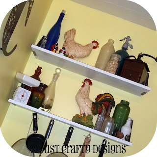
The chickens on the shelves were still in the house when we started the reno. I decided they needed to still live here, along with all my other random vintage stuff. :)
See the ledge the white arrow is pointing to in the photo above? When we decided to do pre-fab tops, we measured our cabinets to see what length we needed. We also measured the depth, just to be safe, and it's a good thing we did. These base cabinets are about 2" deeper than standard cabinets are today, which is what pre-fab is designed for. I had to figure out a solution (since the tile top was already out, oops), and the idea of that ledge came to me.
We installed the counter top, which left about a 1-1/2" gap in the back. We took 1x2's and painted them bronze to match the back splash then coated them with clear poly to protect the wood, then glued them on top of the mini-back splash on the pre-fab counter top to cover the gap. You probably would never have known if I hadn't told you. ;) But it's great. Like another mini-shelf in the kitchen for little odds and ends that always end up in the kitchen. We carried it around to the butcher block for consistency, even though we didn't need to since the butcher block was custom-made by my handy hubby. He did such a great job!
I mentioned this would be a two room show and tell. Here's room number two. It is right off the kitchen, so it made perfect sense to make it a little breakfast nook/conversation area/reading nook since it couldn't be our dining room.
We made a simple bench for under the window that is deep enough to lay down on. Look for a make-over on it soon, though. It needs a new color and a cushion still. But it has been a great little addition, and I can just see my kiddos eating their breakfast here or doing their homework. Can't wait!
I have to brag. My dear hubby built this breakfast table for us. The top is made of old wood flooring his dad got out of an old house being demolished. I love the texture and coloring it has from the old glue used to lay linoleum on top of it. The base is just a rusted metal pipe welded to a rusted disc off a tractor plow. It is so awesome!
O, and my kitty also loves the window seat. It's her favorite perch in the house, aside from the kitchen window, which she also frequents.
Whew! That was a long one! I hope you were able to stick with me through the end. The kitchen was the hardest project because there was so much to do, which included:
- Painted the walls
- Painted the cabinets
- Installed new flooring
- Installed new hardware
- Installed new light fixtures
- Installed new faucet
- Installed new plugs & wiring
- Installed a new sink
- **Note on this: the old sink was an amazing 38" wide porcelain sink. We had every intention of keeping it because it was AWESOME, but it had been installed under the tile, and when we removed it, the edge of the sink was chipped and had started to rust, meaning it would have to either be an under-mount again or be refinished. Mr. Landlord wasn't having any of it, so we had to get a new sink. I cried a little. But I do love my new sink, and we are saving the old one to maybe have as an outdoor sink. :)
- Installed new counter tops
- Fabricate butcher block
- Fabricate window seat
- Fabricate breakfast table
I'm a pretty proud mama of this baby! It is so light and fresh and exactly how I pictured!
Hope you enjoyed the little B&A tour, too!
Be on the look-out for this month's {Spit*Shined}!
Ta ta for now...


No comments:
Post a Comment
So what did you think? I'd love to know!